PORTAFOLIO
In the following portfolio you will learn a little about me and some of the data visualization projects I've worked on in my academic and professional life.
My work is mostly created in PowerBi because of a personal preference, but many concepts applied here can be simulated in others dashboards using tools such as Tableau and Qlik.
All the data shown in these dashboards has been changed to protect the company’s real data and accomplish the GDPR requirements.
About Me
I am Christian, a passionate about data analysis and business. I really enjoy the perks that we can find when doing a well-done data analysis.
I am curious about innovation, processes, the application of technology in business and creative business models. I am an energetic and collaborative person.
I enjoy learning and sharing, and this is why I created this visual tool to inspire others.

Power Bi
Power Bi is the first visualization tool with which I have had contact and for me it still the most complete in terms of tools provided, the possibility of creating analyses, creativity freedom and its ease of use.
Human Resources Dashboard


Use case:
This is a weekly dashboard for the Human Resources department for an agricultural company. The main resource for them is their people so it's important for them to keep track of all kinds of metrics of their employees.
Data:
For this dashboard the data comes from an ERP where we can find personal information about the employee and their contract situation. We also have transactional data about the salary, daily check-in and check-out, absence, and vacations.
ELT:
This information is already validated since it passed through a DQC process establish in the data capture. The data is pulled out from the ERP DB and sync with a bridge for automatic update. Calculus have been made directly in the Power Query instance.
Purpose:
The main purpose of this dashboard is to keep track of the demographic cohorts of the plantation employees to cover the production headcount and have a full scope of the employee's cultural distribution, as well to evaluate KPI's such as employee turnover, hiring and layoffs.
Cost Dashboard


Use case:
This have dashboard was created for a weekly production cost presentation for the board of this company.
Data:
In this case we use two main sources of data: the weekly cost's forecast and the real executed tasks digitated into an ERP. The cost projection is prepared once a year as a master Excel spreadsheet. For the weekly digitated tasks, the process starts by a manual collection of the data, then its compile to an Excel spreadsheet and finally uploaded to an ERP.
This data contains specific employee tasks detailed by day, an example of this can be the number of boxes packed by someone by day.
ELT:
This data didn’t require much transformation. Mainly the process sone in for this analysis is to create a grouping method in the way the process of production its done. Also, some KPI's are calculated directly in the Power Query platform.
Purpose:
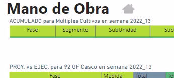
This dashboard has been built for a specific use of the company where the main objective is to evaluate the performance of the weekly production process versus the established forecast made by the cost team at the beginning of the week. In this dashboard the team can compare the real tasks assign to a certain cost center to the projected one and act based on this numbers. They can as well evaluate if there are problems on the production execution and payment of this.
Sales Dashboard


Use case:
This is a CocaCola Company dashboard created specifcly for a final project for my Big Data & Analytics masters degree, as part of the Data Visualization class.
Data:
In this dashboard we took some public data sets of an anonimous retail company, this included some DB's about sales, clients, providers and even some data about Nielsen.
ELT:
As part of the transformation of the data, I changed the terminology and codification of the DB's in order to make it relatable (as the purpose was to build something with the CocaCola brand topic). Apart from this, I realized some tweeks to the data to adapt it to the beverage retail industry and did some calculations in the Power Query tool in DAX.
Purpose:
The end of this dashboard is to give a tool to the sales team of CocaCola Company where they can have a broad overview of the sales and sales cost of the diferent SKU's and brand mainly in Europe.
Detailing
Dashboarding is more than just presenting relevant data. I believe that details in the UX/UI make a totally different experience for the end user. An attractive looking tool is more likely to be used regularly and not forgotten in the back of the closet.
Here some details I like to use in my work:


